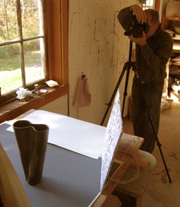
A Natural Light Studio Setup
warren frederick
[2006 Workflow - Changes due to latest Adobe Camera-RAW and PHotoshop CS4 not yet included.]
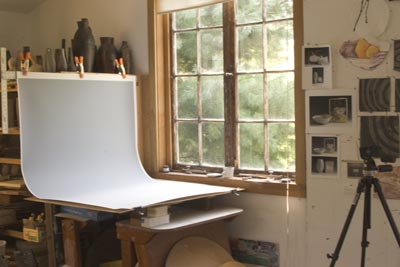
I use natural light through a large, southern exposure window to photograph pottery. The advantages are: (1) beautiful, soft shadows that ground the pottery, (2) the ability to control reflections with a circular Polaroid filter, and (3) fairly quick setup time in a crowded studio with no dedicated space for photographing. The main disadvantage is one of scheduling. Photo sessions must occur in the morning before the sun shines directly through the window. On occasion when forced to photograph later in the day, I have used a translucent paper (Trans-Lum) to diffuse direct light, but it’s not ideal; the light tends to be harsher and almost too bright.
***Please note that the images in this article are merely tokens. They have been drastically resized, for instance to 8KB, from original files that are 24MB--a 3000-fold difference. This explains whatever posterization or non-neutral background colors that are visible. These web versions are not an indication of image quality. ***
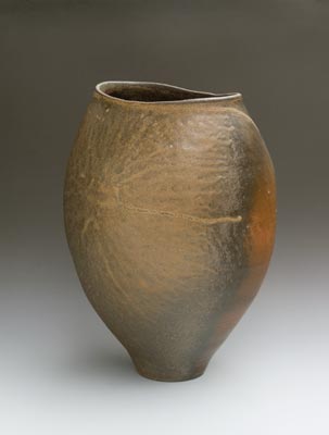
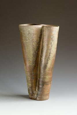
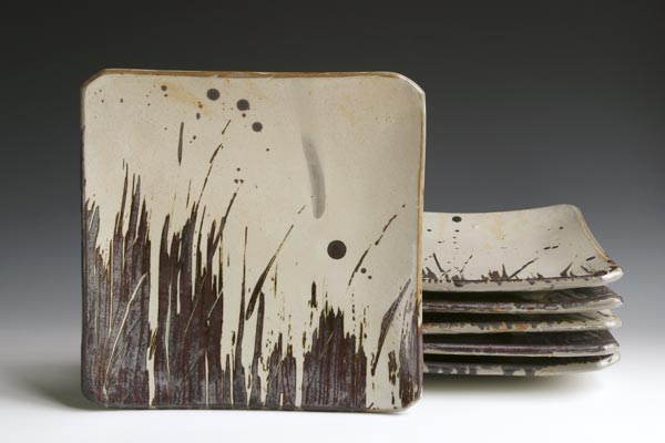
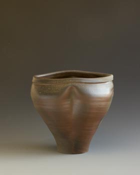
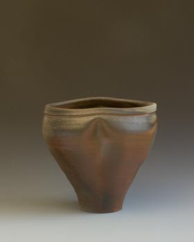
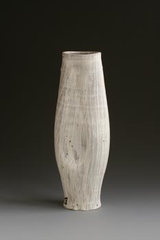
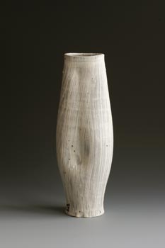
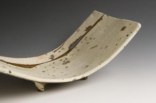
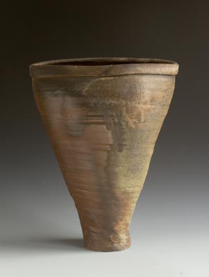
[pottery by Warren Frederick or Catherine White]
I use a Canon EOS 20D usually with a 28-135mm zoom on a tripod. I have used digital “point-and-shoots,” but I feel that their wide angle lens tend to distort the pottery too much. I also moved away from the point-and-shoots because they do not provide files in RAW format. I have come to love RAW files because they permit a quick and superb means to adjust color balance and exposure—more about this below. Any of the least expensive digital single lens reflex cameras from Canon, Nikon, Olympus, Sony, etc. would also perform admirably.
Backdrop
One of the most essential parts of the setup is a graduated backdrop. It is a plastic surfaced (easily scuffed) gradient—for instance, from white-to-black—that I clamp and/or push-pin onto a piece of Homosote, taping down the front edge. There are two sizes and four neutral choices: white-to-black, white-to-dark gray, white-to-soft gray, and dark gray-to-black. [Sources and prices are at the end of this article.]
When I photograph dark woodfired work, the shading-into-black backgrounds are sometimes too dark in value—not distinct enough from the upper portion of the pottery—so I switch to one of the gray gradations. I only use the larger backdrop for bigger pots.
I have also played with reversing the gradient, for instance using black as foreground and white as high background.
Supplemental Light
I almost always use a reflector to light up the dark side of the pot. The area above the foot and beneath the shoulder often requires supplemental light. Usually the reflector is just a piece of crinkled up aluminum foil covering a piece of cardboard with a bent wire adjustable foot (see the setup image). For larger pots I might need a larger circle or sheet of white paper either handheld or propped into position. Large pieces of white foamcore are easy to hold, useful to reflect more window-light back onto the pot. Sometimes the actual shape of the reflector is visible in the pot; I like to make sure it is not distracting by moving it around to determine what looks best. (Obviously this decision is based upon what is visible from the position of the camera, not what is visible standing to the side; they are often quite different.) When the plywood tabletop is exposed, I hide it with a large piece of white paper (or even that elementary school favorite, oaktag) to prevent any light from being reflected off the more yellow plywood which detrimentally alters the color of the pot. I also shut off all lights in the studio; they also negatively affect the final visible color balance of the photograph.
Camera Settings
I work at ISO 200 with the Canon 20D set to take RAW formatted files. RAW provides the best digital “negative” for maintaining the maximum amount of information and flexibility when adjusting photos in Photoshop. If using a camera with only the capability of JPG or TIF files, there is a workaround in Photoshop or Elements via Levels (discussed below) which gives some control over the color balance.
For good depth of field (more areas of the pot are in focus) the camera is set at f16 (Aperture Priority). When autofocus does not work, I manually focus at a point 1/3 of the total distance back from the foremost front edge of the pot measured to the farthest edge of the pot. When the pot is too deep to be fully in focus, an in-focus front rim is usually less disconcerting than an out-of-focus rear rim.
Exposures are often one second or longer; I use a shutter release cable to reduce camera shake, but because the photos are sharp enough I usually don’t bother with diving through the multi-layered menus to keep the camera mirror up.
I always check the histogram to make sure I’m not losing details in the highlights or the shadows. Since the meter (and the resultant automatic shutter speed) provides an exposure for 18% gray, I may need to underexpose (shorter exposure time for less light) with dark woodfired pottery on a dark background. Similarly, white pots on a light gray background might need up to one f/stop worth of additional light. The histogram is a great indicator of what’s needed. Exposure compensation is always achieved by changes in shutter speed, not aperture, in order to maintain the maximum range of sharpness (depth-of-field).
Composition
I always carefully examine the image in the viewfinder to decide on major options. I’ll change the backdrop if there isn’t enough contrast with the pottery.
Altitude:
How much do I want to see into the neck of a vase; how much should (or by shape, must) a bowl be tilted/elevated; is the thrust of the pot better conveyed by a lower point of view? To prop plates up invisibly I have covered heavy firebricks and half-soaps with paper to protect the surface of the backdrop; use the bricks behind the work to stand it up. I also make sure that the shadow of the brick is hidden.Orientation:
Without uniform surfaces (such as in woodfired glazes), I decide which orientation is most dynamic. Centered is rarely good; any sort of diagonal often works well. Sometimes I’ll try multiple orientations and decide which looks best on the computer monitor. Sometimes the less flashy side of a woodfired pot is more intriguing than the flame side with heavy glaze drips.Sets:
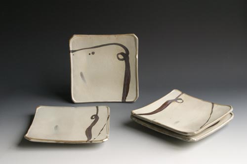
How to capture the intentional variety in a set often depends on the use of the image. Sometimes the suggestion of diversity is enough—one plate up and a clearly different one on top of the stack. In other instances full disclosure captures more nuances so each plate is individually photographed and the full set composited (in Photoshop) into a single image.
Reflections and Highlights
High gloss glazed pottery is the hardest to photograph and sometimes requires the greater control of a darkened room lit only by bounced and diffused photo lights. But since I am rarely photographing highly reflective glazes, this natural light setup works well.
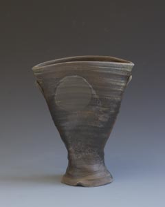
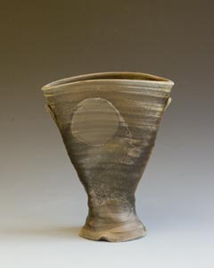
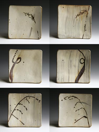
One of the advantages of natural lighting is the options provided by a circular Polaroid filter. At one extreme, one can often remove all highlights or “hot spots.” Or sometimes maintaining a slight highlight adds to the photographic volume of a piece. The choice is personal based upon the feeling desired. The photo sequences below show how dramatically a Polaroid filter can control highlights. [It is more complicated and expensive, but this can also be done when lighting artificially by purchasing a large sheet of Polarizing film to place in front of the fill light(s).]
Developing the Digital Negative
Once I’ve got the RAW file, it’s time to adjust the image in Photoshop. I’m using version CS2 with the latest iteration of Adobe Camera Raw. (Adobe Camera Raw is updated far more frequently than is Photoshop itself, mainly to encompass the formats of new cameras.) One could also use the currently free beta version of Adobe Lightroom. I don’t use it, but I believe the most important capabilities—white balancing, levels and curves—are also available in Adobe’s Elements program.
Fidelity versus Exaggeration:
It is easy to create dramatic photos by increasing contrast to heighten glaze nuances and coloration, but my goal is always to maintain fidelity to the actual object. Sooner or later a pot may be paired with its photo; artistically I believe the object is more important than the photo so fidelity is paramount. When a photo itself is the artistic endpoint, then the photographic artist can do whatever is required to create a desired feeling because in that context there is no connection to a physical object.Calibration:
I have an accurately calibrated monitor (for instance via Spyder) so that I know I am looking at an accurate rendition of the digital file.Image Processing:
I open the first image via the Adobe browser, [Adobe Bridge] because after adjusting this image—if the lighting hasn’t changed during a photo session—I will be able to quickly select all the other session thumbnails in Bridge and “apply the previous [first] conversion” to all the files. I don’t use any “Auto” settings, but save my basic choices as the default.
Exposure Adjustment: I spread the histogram values towards white and black by adjusting/dragging the exposure slider and the shadows slider. [I never use Auto.] The dynamic preview lets you see what is happening. Usually I move the sliders until the two tips of the histogram are just touching the endpoints of the box--representing totally white and black values. When an image should not have any areas that are totally white or black, then the tips of the histogram will not reach the sides of the box graph; check the preview to decide what’s appropriate.
RAW White Balance: The “White Balance Tool (I),” the first eyedropper in the upper left corner of the RAW dialog box, adjusts the white balance thereby knocking all the colors into line. As the eyedropper is moved around the (neutrally-colored) backdrop of the image, the corresponding R-G-B values are shown in the upper right. When the eyedropper is clicked on one point of the backdrop, the White Balance temperature (a Kelvin value) and the tint are altered to make R=G=B. During a photo session natural light changes so the Kelvin temperature may vary slightly from image to image. With a calibrated monitor, one can also drag the Kelvin temperature slider to obtain an accurate rendition.
The image on the left is the unaltered RAW file;
exposure and white balance adjusted on the right:
There is often a slight variation in color temperature from the brighter to the darker side of the backdrop. In my setup the middle portion of the lit side (middle right) is often truest to the actual glaze colors and the neutral color of the backdrop. I watch the preview as I click at different points before I choose the most accurate adjustment.
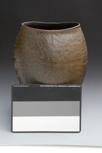
When I photograph objects that are not on a neutral backdrop I use a neutral card. GretagMacbeth makes a “Gray Scale Balance Card” which has white, gray and black stripes. There’s also a small, pocket size set made by WhiBal (www.whibal.com). I either leave the card in the frame if it is easy to crop out later or I take an extra frame with the card, front and center, so I can use it in the Adobe RAW dialogue to get the correct white balance values for the rest of the images in that photo session.
JPG and TIF White Balancing: Without RAW files some white balancing can still be achieved via the Levels dialogue in Photoshop (or Elements) to create an adjustment layer. In the lower right of the Levels dialogue are three eyedroppers for setting the black, gray, and white points (from left to right) in an image. If there is a neutral gray card in the image, one can use the middle eyedropper to click on that neutral gray patch to adjust that color to neutral (R=G=B), thus automatically accurately rendering all other colors. Or with a gradated backdrop, just choose a middle gray point in the backdrop to set the white balance (as described above).
I rarely use the default setup for the white and black points because many nuances are lost if the lightest values are converted to total white, and dark values are converted to total black. First double click on the black-point (left) eyedropper and the color palette will appear. As a place to start change the three R-G-B values to 15-15-15 (instead of 0-0-0). Similarly click on the white-point (right) eyedropper and changes the values to 240-240-240 (instead of 255-255-255). When asked whether these should be saved as the default values, say yes. They can always be changed, as needed, based on your trial/error experience. Now if you use the white-point or black-point eyedropper to, respectively, click on the lightest or the darkest patch in the image, the results will be more acceptable
Tone Curve: Under the RAW dialogue “Curve” tab I often choose the understated “Linear” and not the seductive “Medium Contrast” curve, because I would rather have an always alterable Curves adjustment layer in a Photoshop PSD file. The “Linear” choice maintains subtleties in the colorations of our white slipped work and wood fired work.
Other Adjustments in RAW: While there are many other adjustments possible in RAW, I usually make them (when possible) within Photoshop layers. The major adjustment I won’t discuss here is sharpening. For images destined for high quality printing, I’ll do sharpening with the plug-in PhotoKit Sharpener (www.pixelgenius.com) which provides an adjustable/editable sharpening layer. (A great source for in-depth info is Bruce Fraser: Real World Camera Raw with Adobe Photoshop CS2 and Real World Image Sharpening.)
Format, Resolution and Use:
In addition to the RAW file, I always save the original adjusted file in PSD format and make appropriately resized copies for each specific use. I use Photoshop’s PSD format because adjustments are always alterable; the underlying “negative” isn’t affected. Because of “lossy” compression, the continued opening and resaving of files as JPGs should be avoided because the file becomes degraded. For commercial printing presses one can use a TIF file (without any layers) or the best quality JPG possible [one can use a “Save As” JPG at the highest (12 out of 12) setting]. Photoshop also gives you the capability of saving an image with text (perhaps for a postcard) as a PDF file—another reliable printing standard.
I drastically reduce the file size for web-destined images because they still look great but load quickly. An appropriately resized file for web use or e-mail is perhaps 500 pixels in width or 300 pixels in height (alter via the menu choice “Image/Image Size” with “resample” checked yes). Balancing quality and size, I use the Photoshop “Save For Web” with settings for a JPG of Quality 45 (out of 100; or use a “Save As” JPG set at 4 out of 12).
For real (offset) printing I usually aim for 300 dpi (dots-per-inch) at the printed size. Even this isn’t always enough resolution; Modern Postcard requires 355 dpi at the printed size. Inkjet printing is far more forgiving; often 240 dpi images (on high quality photo paper) will print well.
Cropping:
I crop closer when preparing images for the web. For high quality images I always let the pottery “breath” by having more room above than below. Somehow it’s a balance between getting as close as possible, but also being respectful of the pot’s volume and presence.
More photography examples on websites:
artistpotters.com
catherinewhite.com
warrenfrederick.com
*********************************************************************
SOURCES
Graduated backgrounds:
I have purchase backdrops from Photo Tech
http://phototechinc.com/graduate.htm
Varitone; gradated background on vinyl
two sizes; 42 x 62 ($59.20) and 31 x 43 ($31.60)
09 goes from white to black
39 goes from white to dark gray
28 goes from white to soft grey
928 dark gray to black
[I don’t believe in the colored gradations even though I’ve got an inspiring yet bizarre four volume set of Chinese ceramics photographed on bright colored backdrops to create 3-D Viewmaster images.]
I have not bought from this source, but the larger backdrop is cheaper at $49:
http://web.ivenue.com/simondsphotographic2/item471893.ctlg
Prices at this last link were: 42” x 62” ($52.95), and for 31” x 43” ($28.95).
http://www.photographyprops.com/index.asp?PageAction=VIEWCATS&Category=197